Feature Importance
Part of training a model is not just to see how accurate it can make a prediction, but why it made the prediction. Understanding and explaining a model’s behavior is part of ensuring it is fair, inclusive, reliable and accountable. Some industries have compliance regulations that require organizations to provide an explanation for how and why a model made the prediction it did. The Responsible AI (RAI) dashboard provides the Feature Importance component that is an interactive user interface (UI) which enables data scientists or AI developers to see top features in their dataset that drove a model’s prediction.
The Feature Importance section of the dashboard helps provide a better understanding of the model’s behavior. The dashboard provides both Global and Local explanations. For example:
- Global Explanation: What are the top factor impacting the model's overrall predictions?
- Local Explanation: Why did patient X get readmitted in the hospital in less than 30 days? Here, the dashboard could drill-down to the test dataset and show that Patient X has been predicted to be readmitted within 30 days in a hospital because of a history of other health diagnoses.
In this lab, you will explore how to use the Feature Importance component of the RAI dashboard.
View the top features driving the model's overall predictions#
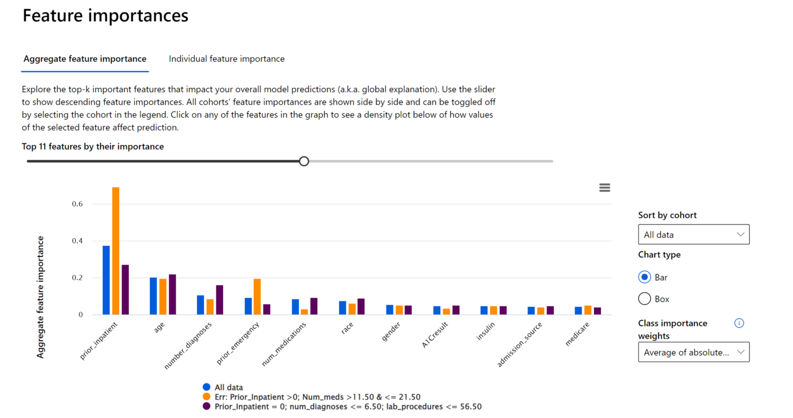
The RAI dashboard displays the top data features that drove a model’s overall predictions in the Feature Important component of the dashboard. This is also known as the global explanation.
- Toggle the slider back-and-forth on top of the chart to display all the features, which are ordered in descending order of importance on the x-axis.

- Observe the y-axis scale to see how much weight a feature has in driving a model’s prediction in comparison to the rest of the other features.
- Compare the color of bar(s) on the chart that correspond to the cohorts created on the dashboard. In our case, there's “All data”, which is the default cohort with all the test dataset. Also, we have the user-created cohorts with the highest and least error rate.
Check a Feature's influence on a Model Prediction#
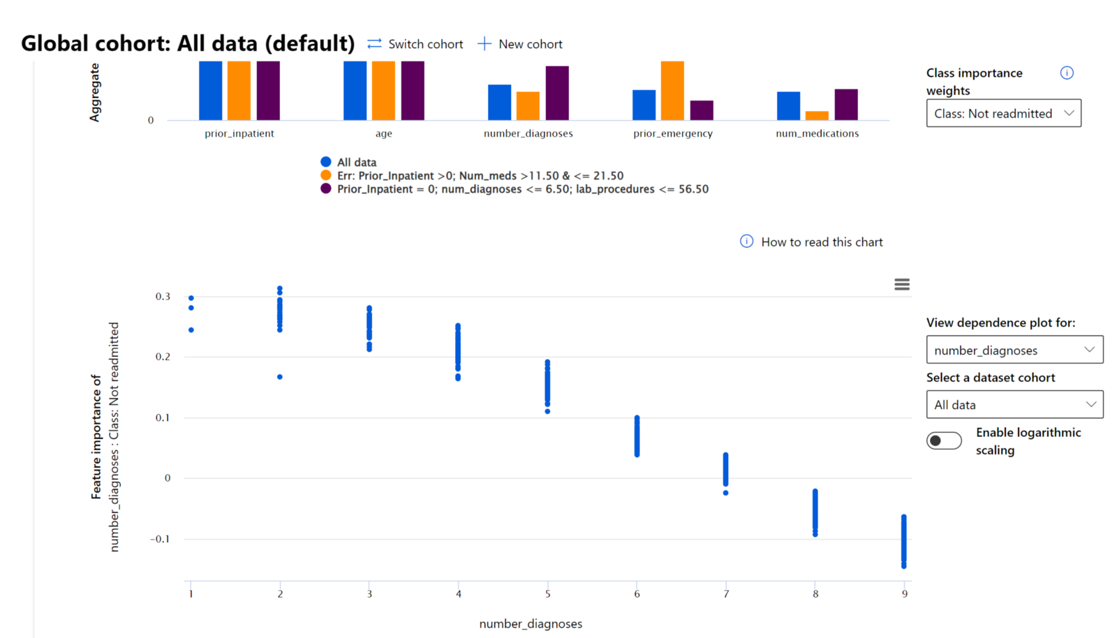
- To take a closer look into a feature to see how the model uses it values in making a prediction, we'll select the "Class: Not Readmitted" under the Class importance weights drop-down menu on the right-hand side of the dashboard.
- Double-click on the "number_diagnoses" bar from the "All data" cohort (in blue color). This generates another chart below the Aggregate feature importance chart.

- The x-axis displays the number of diagnoses were entered into the system for the diabetic patient.
- The y-axis displays, the level of contribution to the model making a prediction of Not Readmitted. Where numbers above 0 show the level of positive contribution to the model's prediction of a patient Not Readmitted and numbers below 0 show the level of negative contribution against the model's prediction for Not Readmitted.
- As you can see from the graph, as we progress from 0 to 11 in the number of "number_diagnoses" the more the model's confidence in a patient not readmitted within 30 days back to the hospital decrease.
- The chart shows that after number of diagnoses is 7 or greater, the class starts to negatively impact the "Not Readmitted classification", which leads to a "Readmitted" classification. This makes sense because the more a diabetic patient has other additional medical conditions, the more prone they are to getting sick and returning back to the hospital again.