Data Analysis individual datapoints
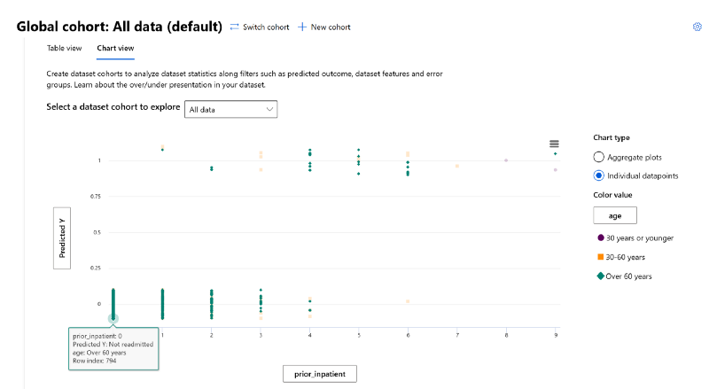
The RAI dashboard provides individual data points view of each patient as well. With this, you can add a third field (e.g. data feature, trueY, predictedY etc) and see how the field is represented with individual data points if you want to isolate and examine each individual data point. One of the benefits is, you can choose 3 metrics to display on the chart. For analysis we'll focus on where there is more concentration for patients in the difference age groups when it comes to whether or not they will be readmitted in 30 days.
- Under the "Select a dataset cohort to explore" drop-down menu, choose "All data".
- On the y-axis, select "Predicted Y". Note: enable the option for "Should dither" to display the unique values.
- On the x-axis, we'll select the "prior_inpatient".
- Under the "Chart type" on the right-hand side, select the "Individual datapoints" radio button. Under "Color value" select "age" from the Dataset.
- The chart should display 2 lines for "Predicted Y": 0 for "Not Readmitted"; 1 for "Readmitted". In this case, you will see the data representation of age and what impact "prior_inpatient" has to a patient's hospital readmission.

- To isolate the color on the chart, hover you mouse over any green data point. Repeat for the orange and purple colors.
- On line 0 (representing "Not Readmitted"), review the following individual datapoints:
- There is more concentration of datapoints with patients "Over 60 years" (in green color) that are not readmitted back to the hospital when they have a prior history of hospitalization between 0 and 4. The concentration slowly decreases, the higher the number of prior_inpatients.
- The same is true for patients age "30–60 years" (in orange color).
- Patients age "30 years or younger" (in purple color) only show a datapoint concentration when prior_inpatients = 0, meaning prior number of hospitalization does not drive the outcome of whether they will not be readmitted.
- On line 1 (representing "Readmitted"), verify the following individual datapoints:
- The concentration of datapoints for patients "Over 60 years" slowly increases, the higher the number of prior_inpatients between 1 and 9. This show that a prior history of hospitalization has a significant impact to senior citizen patient being readmitted back to a hospital with 30 days.
- The same is true for patients age "30–60 years".
- Patients age "30–60 years", have a datapoint at prior_inpatient = 8 and 9. This could be outliers since there's not any datapoints to form a conclusion.

As you can see from all the data analysis we performed in this lab, data is a significant blind-spot that is often missed when evaluating model performance. After tuning a model, you can increase the performance but that does not mean you have a model is also fair and inclusive. A prime example was the patient's "race" and "age". Although the race feature did not come up during our error analysis or model overview investigation, the Data Analysis component of the RAI dashboard exposed this discrepancy.
This also shows that in the data analysis process, there are gray areas where data scientists will need to work very closely with business stakeholders or decision makers to understand if the data represents reality or not.