Feature Cohort
The RAI dashboard helps data scientist or AI developers examine the model performance across different cohorts within a given feature as well. In some cases feature-based analysis is necessary to separate the data into a specific feature and pinpoint the root cause of some of the errors. Whether it is one feature, or a combination of two features, the RAI dashboard has built-in intelligence to divided feature values into various meaningful cohorts for users to do feature-based analysis and compare where the model is not doing well. Since the cohort with the highest error has patients with the number of Prior_Inpatient > 0 days and number of medications between 11 and 22 was where the model had a higher error rate, taking a closer look at the “Prior_Inpatient” and "Num_medications” will help isolate where there are issues. For this lab, we'll only analyze "Prior_Inpatient".
- Click on the Feature Cohorts tab.
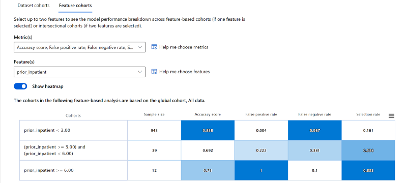
- Under the "Feature(s)" drop-down menu, scroll down the list and select the "prior_inpatient" checkbox. This will display 3 different feature cohorts and the model performance metrics.

- The prior_inpatient < 3 cohort has a sample size of 943. This means a majority of patients in the test data were hospitalized less than 3 times in the past. The model's accuracy rate for this cohort is 0.838, which is good.
- Only 39 patients from the test data fall in the prior_inpatient ≥ 3 and < 6 cohort. The model's accuracy rate is 0.692, which is not good.
- Lastly, just 12 patients from the test data have a prior hospitalization greater than or equal to 6 days. The model accuracy of 0.75 for this cohort is ok.
Feature probability distribution#
Similar to the Dataset cohort, you have the ability to view the “Probability Distribution”.
- You can see that the lesser the diabetic patient’s number of prior_inpatient hospitalizations, the more likely the patient was not going to be readmitted in 30 days. This makes sense, because if a patient is more prone to be hospitalized in the past, it’s fair to assume that they get sick a lot which requires them to get hospitalized.

Feature Metrics visualizations#
- On the x-axis, click on the "Choose label" button. Then select the "Precision score" metric.
- You see that the precision score for patients with prior_inpatient < 3 is 0.40, which is very bad. This means that all the predictions that the model made, only 40% were correct for this cohort.

- The precision score for the other 2 cohorts are good.
- Next, select "Recall score" metric for the x-axis.
- On the contrary, you'll see the recall score for patients with prior_inpatient < 3 is 0.013. Meaning, for a majority of patients in the test data, the model is having difficulty correctly predicting whether the patient will be readmitted within 30 days or not.

This lab shows how the traditional model performance metrics (e.g., accuracy, recall, confusion matrix etc) are still very important. By combining RAI insights and traditional performance metric, the dashboard gives us a holistic tool to analyze and debug the model on a more granular level.