Model Overview
Part of evaluating the performance of a machine learning model is getting a holistic understanding of its behavior. This sometimes involves doing comparative analysis to help shed light on how the model is performing with one subgroup of the dataset vs another.
In this lab we will explore how to use the Model Overview section of the Azure Responsible AI (RAI) dashboard. We will use the cohorts created from the Error Analysis lab to investigate why the model’s behavior is better in one cohort vs another cohort.
Review and compare model performance metric table#
In the previous lab, you used the Error Analysis tool of the RAI dashboard to discover cohorts where the model had the highest error rates as well as cohort with the lowest errors. Now, you are going to investigate why the model’s behavior is better in one cohort vs another cohort using the Model Overview.

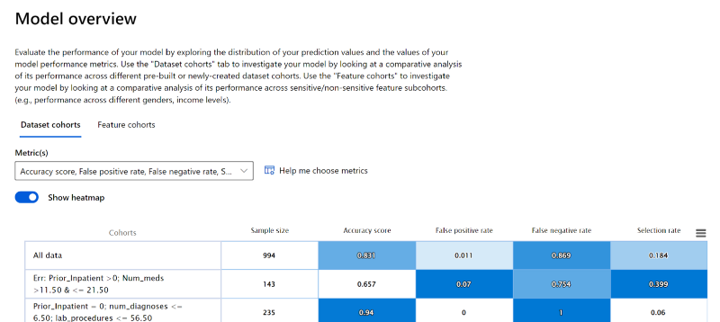
Under Model Overview, select the “Dataset Cohorts” pane. This displays the different cohorts created in a table with the model metrics.
Compare the cohort with the most errors “Err: Prior_Inpatient > 0; Num_Meds > 11 and ≤ 21.50” verse the least errors “Prior_inpatient = 0; num_diagnose ≤ 6.50; lab_procedures < 56.50”
Hover the mouse over the box plot line on the chart to see the measurement details.
Observe that the accuracy score for the erroneous cohort is 0.657, which is bad. The false positive rate is very low; meaning the model is incorrectly predicting that patients are not going to be readmitted when in actuality the patients will be readmitted back to the hospital in 30 days.
On the contrary, the false negative rate of 0.754 is high. Meaning, a majority of patients that the model is predicting have a high error rate of predicting patients that will not being readmitted as readmitted within 30 days back to the hospital.
Next, the metrics for the cohort with the least errors have an accuracy score of 0.94, which is far better than the overall accuracy score of the model with all the data. However, this cohort also has a low false positive rate at 0.
Examine the Probability distribution chart#
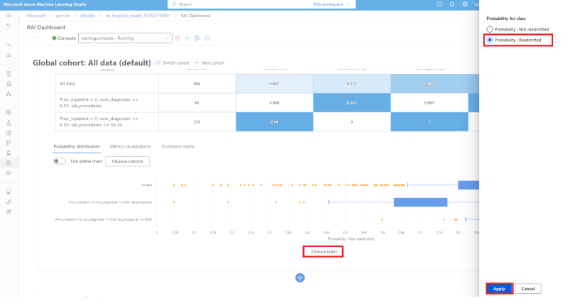
The Probability distribution chart shows the model’s probability predicting if patients in the cohorts will be Readmitted or Not readmitted back to the hospital within 30 days.

- Compare the probability of the patients not being readmitted for all 3 cohorts.
- You'll see that the “All data” cohort with all the patients test dataset, show that a majority of the patients will not be readmitted back in the hospital within 30 days, with a median probability of patients not readmitted at 0.854 and upper quartile at 0.986, which is good. We would not want a high frequency of patients being readmitted back to a hospital in a few days after being discharged.
- Next, the cohort with the highest error rate: Err: Prior_Inpatient >0; Num_meds >11.50 & <= 21.50, shows a slightly lower probability at 0.89 and a median of 0.719.
- Lastly, the cohort with the least error rate: Prior_Inpatient = 0; num_diagnoses <= 6.50; lab_procedures <= 56.50, show a probability of patients not readmitted has a median of 0.90 and upper quartile of 0.986.
- To change the chart to show the probability of patients being Readmitted for the 3 cohorts, click on the "Choose Label" button on the x-axis.

- Select the "Probability: Readmitted" radio button. On the pop-up window pane.
- Then click on the "Apply" button.
- Compare the probability of patients being Readmitted for the 3 cohorts

- You see that the 3 cohort have a probability of being readmitted less than 0.55. The cohort will the least number of model errors has the lowest probability of 0.179. The cohort with the most errors has the highest probability at 0.543.
Review the Metric visualization chart#
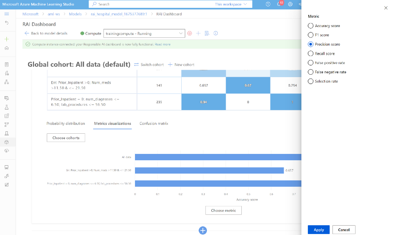
Now let's get a deeper understanding of the model's performance by switching to the Metric visualizations pane. Since you've already reviewed the accuracy score under the "Dataset Cohort" above, you'll explore what the other metrics can reveal about the 3 cohorts.
Click on the Metric visualizations tab.
To choose another metric, click on the "Choose Label" on the x-axis to choose "Precision score" from the list of other available metrics. Then click on the "Apply" button. Note: Since the trained model is a classification problem, the RAI dashboard will display only classification metrics.

From reviewing the chart, you will see that the model performance for all test data cohort and erroneous cohort is correct at ~70% of the time. The Precision score rate for the least erroneous cohort is 0.94 for patients with no prior hospitalization and the number of diagnoses is less than 7. This is consistent with the accuracy score.
Finally, change the metric to "Recall" to see how well the model was able to correctly predict that the patients in the cohorts will be readmitted back in the hospital in 30 days. The recall shows that the model's prediction was correct less than 25% of the time for all the cohorts for patients being readmitted. This reveals that the model's predictions are not correct a majority of the time when trying to predict patients that will be readmitted within 30 days.

Look at the Confusion Matrix#
The Confusion Matrix is helpful to check the rate of the model correctly making the right prediction. This will reveal how well the model is learning for cases where the patient is readmitted back in the hospital within 30 days vs not readmitted.
- Click on the "Confusion matrix" tab.
- You will observe that the model is performing better with patient that are "Not Readmitted" compare to "Readmitted". The number of False Negative should be less that True Negative. This mean out of all the patient data, the model was only able to predict 24 patients correctly to be Readmitted back to the hospital in < 30 days.
- The number of True Positive (TP) is: 802
- The number of False Negative (FN) is: 159
- The number of False Positive (FP) is: 9
- The number of True Negative (TN) is: 24